I swear if I could have a career do-over, I’d be a graphic designer.
I really appreciate good design, and as a words person, I especially love fonts and typefaces.
But (as a words person) I’m NOT good at creating beautiful design. And one of the things I’ve loved about being a Waldorf teacher is that I’m encouraged to push the bounds of my skills AND find ingenious little hacks for creating the beauty that I’m after.
Starting in fourth grade or so, once they were pretty solid with cursive writing, I started playing with interesting lettering with my students. I used a couple of strategies.
Vary Line Thickness and Color
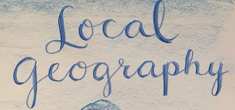
I learned from some of the hand-lettering artists I follow on Instagram to thicken the downstroke of every letter.
This example is a little sloppy, but if you look from a distance, it looks pretty good. Here’s the step-by-step I used.
Keep reading with a 7-day free trial
Subscribe to Waldorf at Work to keep reading this post and get 7 days of free access to the full post archives.


